
Inspiring Squarespace Blog Layout Examples (Minimalist, Image‑Heavy, Magazine & Creative)
When I started my first Squarespace blog, I was overwhelmed. Beautiful templates were everywhere, but I couldn't quite pinpoint what made some layouts stand out while others fell flat.
If you're feeling stuck or just looking for inspiration, I’ve curated some of my favorite real-world Squarespace blog examples below. I'll break down exactly why these layouts work so well and how you can borrow their best features to create a blog that your audience won't want to leave.
Along the way, you’ll find actionable tips to make your own Squarespace blog layout more interesting and functional, best practices for structuring content, and SEO considerations (like navigation, mobile responsiveness, and readability) to keep in mind. Let’s dive in!
Minimalist Squarespace Blog Layout – Benedict Evans
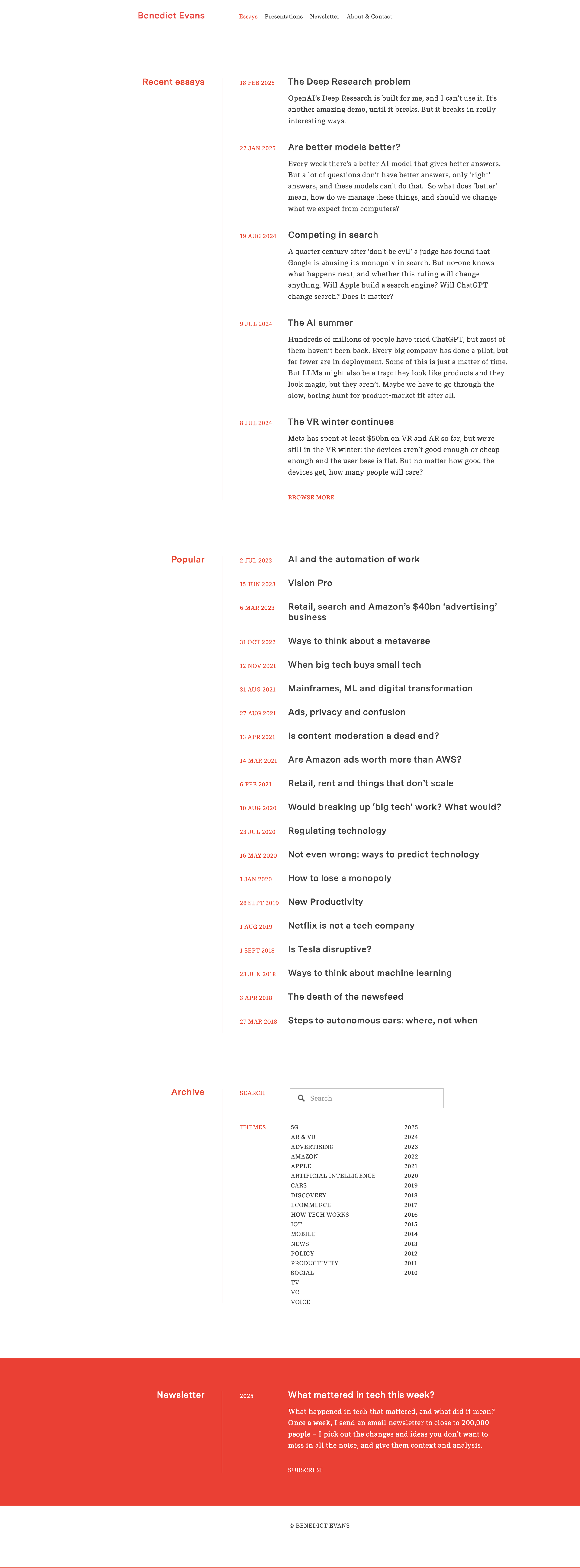
For a great example of a minimalist blog design, look at tech analyst Benedict Evans’s Squarespace blog. The layout is extremely clean: plenty of white space, simple typography, and almost no superfluous elements. The homepage presents a list of essay titles and brief excerpts in a single column, with a basic header menu and no clutter. This simplicity keeps all the attention on the content.
Why this layout works well:
Maximizes readability – High-contrast text on a white background and a legible font size make long-form articles easy on the eyes.
Simple navigation – Just a few links (Essays, Newsletter, etc.), ensuring visitors aren’t overwhelmed.
Fast loading time – No unnecessary images or widgets slowing down the site.
Image‑Heavy Squarespace Blog Layout – Meiwen See

In contrast to minimalist sites, some blogs captivate visitors through image-heavy layouts. Meiwen See’s Squarespace blog is a stunning example of a photography-driven design. The homepage features a grid-style arrangement of posts with bold thumbnail images and minimal text. Inside each post, large photos are accompanied by short paragraphs, making the content easily scannable and visually engaging.
Why this layout works well:
Strong visual storytelling – Striking photographs immediately grab attention.
Balanced text-to-image ratio – Short paragraphs ensure readability while keeping the focus on visuals.
Clean and consistent styling – A simple background and easy-to-use navigation enhance user experience.
Magazine‑Style Squarespace Blog Layout – Deem Journal

For content-rich sites, a magazine-style layout can be very effective. Deem Journal, an online design journal built on Squarespace, exemplifies this style with a bold and organized presentation. Upon landing on the blog section, visitors are greeted with a featured article showcased prominently with a large image and title. Below, the rest of the posts appear in a three-column grid.
Why this layout works well:
Boosts engagement – The grid allows users to scan multiple articles quickly.
Creates an editorial feel – Large images and bold typography make it visually appealing.
Responsive for all devices – The grid collapses neatly on mobile screens, maintaining usability.
Simple Squarespace Blog Layout – AAKS (Brand News)

Some of the most inspiring blog designs take a creative, brand-centric approach. The AAKS “News” blog is a perfect example of a creative Squarespace blog design that aligns with branding. The layout is a colorful grid of post previews with a simple menu bar at the top for filtering categories.
Why this layout works well:
Reflects brand identity – Vibrant colors and imagery align with AAKS’s aesthetic.
Simple but functional – Clean structure with easy-to-navigate filters.
Immersive storytelling – Behind-the-scenes visuals keep readers engaged.
Third-Party Squarespace Blog Layout Examples
Kintsugi by Studio Mesa

Some of the most structured blog designs focus on clarity and accessibility. The Kintsugi Squarespace Template is designed for service-focused businesses and features a clean, calming aesthetic with a structured grid-based blog layout. Each blog post is displayed in uniform card-style previews, making excellent use of whitespace and typography to enhance readability. The inclusion of category tags above each post allows for intuitive navigation, helping visitors browse content based on topics of interest.
Why this layout works well:
Reflects clarity and professionalism – A structured grid layout keeps content visually organized and easy to digest.
Enhances navigation – Category tags provide a streamlined browsing experience, allowing readers to filter content effortlessly.
Balances aesthetics and usability – Thoughtful use of whitespace and typography creates an inviting reading experience without overwhelming the viewer.
Launch Day by Applet Studio

Some blog designs embrace bold, high-contrast visuals to capture attention immediately. The Launch Day Squarespace Template features an energetic and modern blog layout with large, colorful headings that command attention. Blog posts are arranged in a structured grid with rounded image thumbnails, offering a sleek and engaging look. The top section categorizes content into clear, clickable sections, ensuring that visitors can quickly navigate to the topics that interest them.
Why this layout works well:
High-impact visual appeal – Bold typography and color contrast create an engaging first impression.
Clear content segmentation – The structured layout makes it easy to browse different categories at a glance.
Modern and playful aesthetic – Rounded thumbnails and contemporary design elements add a creative touch that resonates with service-based businesses and creative professionals.
Unearth by Big Cat Creative

Some of the most artistic blog layouts combine editorial storytelling with a visually compelling design. The Unearth Squarespace Template embraces an artistic, magazine-style aesthetic that balances imagery with typography. Perfect for designers, artists, and branding professionals looking to showcase their content in a creative yet structured manner. The soft color palette and refined typography enhance the visual appeal, while content categories are subtly integrated to guide the reader seamlessly through different topics.
Why this layout works well:
Balanced imagery and text – Well-placed visuals complement the content without overpowering it.
Elegant navigation – Subtle category organization makes it easy for visitors to explore different topics while maintaining a polished aesthetic.
Tips for Designing an Engaging Squarespace Blog Layout
1. Prioritize Readability with a Clean Design
Use a legible font and ample whitespace.
Keep color schemes simple for better text contrast.
Ensure text is properly spaced for comfortable reading.
2. Use High-Quality Images to Enhance Content
Select striking featured images for each post.
Optimize images to avoid slow loading times.
Use a consistent aspect ratio for thumbnails to maintain visual harmony.
3. Keep the Layout Uncluttered
Avoid excessive widgets, pop-ups, and distractions.
Maintain a consistent design language across all pages.
Stick to a logical content hierarchy.
4. Ensure Clear and Intuitive Navigation
Place the main menu at the top for easy access.
Use category filters or a search bar to help users find content.
Consider a sticky header for quick navigation.
5. Incorporate Branding and Personality
Align colors, fonts, and imagery with your brand.
Create a unique blog identity that stands out.
Use personalized blog post templates to maintain consistency.
SEO Considerations for Blog Layout
Mobile responsiveness is crucial. Testing your layout on different devices ensures that text and images scale properly and that navigation remains user-friendly. A mobile-friendly menu helps users access content easily without unnecessary zooming or scrolling.
Optimizing site structure enhances discoverability. Logical organization of categories and tags, along with internal linking, makes it easier for visitors and search engines to explore your content. Breadcrumb trails or “Related Posts” sections further encourage engagement by guiding readers to additional content.
Site speed plays a key role in rankings. Compressing images reduces file sizes, preventing slow load times, while avoiding excessive animations and enabling lazy loading ensures a smooth browsing experience. Fast-loading pages not only improve user experience but also send positive signals to search engines.
SEO metadata and alt text should be strategically implemented. Compelling SEO titles and meta descriptions improve visibility, while descriptive alt text for images enhances accessibility and increases the chances of appearing in image searches. Using clear, descriptive URLs (such as
yourdomain.com/squarespace-blog-layouts) further improves search engine ranking and user experience.
Conclusion
Your blog’s layout is the framework that supports your content. As we’ve seen through these real Squarespace blog examples, there’s no one-size-fits-all design – you might opt for a minimalist single-column feed, an image-heavy gallery, a polished magazine grid, or a creative brand-centric layout. What matters is that your design serves your content and audience.
Take inspiration from the examples above: borrow ideas like using white space for focus, striking imagery to draw in readers, or organizing posts in a grid for variety. Then, apply the best practices and tips provided—such as maintaining readability, using headings, optimizing for mobile, and keeping your site structure intuitive.
With thoughtful design choices, you can transform your Squarespace blog into an engaging, SEO-friendly, and visually stunning space that keeps readers coming back. Happy blogging!